This is the first post of a short series to show some code I have learnt to produce maps with R.
NOTE: Although the procedure described in this post is valid, there is anewer code version in one of the chapters of the book “Displaying time series, spatial and space-time data with R“
Some time ago I found this infographic from The New York Times (via this page) and I wondered how a multivariate choropleth map could be produced with R. Here is the code I have arranged to show the results of the last Spanish general elections in a similar fashion.
Some packages are needed:
|
1
2
3
4
5
6
7
8
|
library(maps)library(maptools)## EDITED: if you have rgeos installed you won't need## gpclibPermit() below.library(sp)library(lattice)library(latticeExtra)library(colorspace) |
Let’s start with the data, which is available here (thanks to Emilio Torres, who “massaged” the original dataset, available from here).
Each region of the map will represent the percentage of votes obtained by the predominant political option. Besides, only four groups will be considered: the two main parties (“PP” and “PSOE”), the abstention results (“ABS”), and the rest of parties (“OTH”).
|
1
2
3
4
5
6
7
8
9
10
11
12
13
|
votesData <- votos2011[, 12:1023] ##I don't need all the columnsvotesData$ABS <- with(votos2011, Total.censo.electoral - Votos.validos) ##abstentionMax <- apply(votesData, 1, max)whichMax <- apply(votesData, 1, function(x)names(votesData)[which.max(x)])## OTH for everything but PP, PSOE and ABSwhichMax[!(whichMax %in% c('PP', 'PSOE', 'ABS'))] <- 'OTH'## Finally, I calculate the percentage of votes with the electoral censuspcMax <- Max/votos2011$Total.censo.electoral * 100 |
The Spanish administrative boundaries are available as shapefiles at the INE webpage (~70Mb):
|
1
2
3
4
5
6
7
8
9
|
espMap <- readShapePoly(fn="mapas_completo_municipal/esp_muni_0109")Encoding(levels(espMap$NOMBRE)) <- "latin1"##There are some repeated polygons which can be dissolved with## unionSpatialPolygons.## EDITED: gpclibPermit() is needed for unionSpatialPolygons to work## but can be ommited if you have rgeos installed## (recommended, see comment of Roger Bivand below).espPols <- unionSpatialPolygons(espMap, espMap$PROVMUN) |
(EDITED, following the question of Sandra). Spanish maps are commonly displayed with the Canarian islands next to the peninsula. First we have to extract the polygons of the islands and the polygons of the peninsula.
|
1
2
3
|
canarias <- sapply(espPols@polygons, function(x)substr(x@ID, 1, 2) %in% c("35", "38"))peninsulaPols <- espPols[!canarias]islandPols <- espPols[canarias] |
Then we shift the coordinates of the islands:
|
1
2
3
4
5
|
dy <- bbox(peninsulaPols)[2,1] - bbox(islandPols)[2,1]dx <- bbox(peninsulaPols)[1,2] - bbox(islandPols)[1,2]islandPols2 <- elide(islandPols, shift=c(dx, dy))bbIslands <- bbox(islandPols2) |
and finally construct a new object binding the shifted islands with the peninsula:
|
1
|
espPols <- rbind(peninsulaPols, islandPols2) |
The last step before drawing the map is to link the data with the polygons:
|
1
2
3
4
5
6
7
8
9
10
11
12
13
14
15
16
|
IDs <- sapply(espPols@polygons, function(x)x@ID)idx <- match(IDs, votos2011$PROVMUN)##Places without informationidxNA <- which(is.na(idx))##Information to be added to the SpatialPolygons objectdat2add <- data.frame(prov = votos2011$PROV,poblacion = votos2011$Nombre.de.Municipio,Max = Max, pcMax = pcMax, who = whichMax)[idx, ]row.names(dat2add) <- IDsespMapVotes <- SpatialPolygonsDataFrame(espPols, dat2add)## Drop those places without informationespMapVotes <- espMapVotes[-idxNA, ] |
So let’s draw the map. I will produce a list of plots, one for each group. The“+.trellis” method of the latticeExtra package with Reduce superposes the elements of this list and produce a trellis object. I will use a set of sequential palettes from the colorspace package with a different hue for each group.
|
1
2
3
4
5
6
7
8
9
10
11
12
|
classes <- levels(factor(whichMax))nClasses <- length(classes)pList <- lapply(1:nClasses, function(i){ mapClass <- espMapVotes[espMapVotes$who==classes[i],] step <- 360/nClasses ## distance between hues pal <- rev(sequential_hcl(16, h = (30 + step*(i-1))%%360)) ## hues equally spaced pClass <- spplot(mapClass['pcMax'], col.regions=pal, lwd=0.1, at = c(0, 20, 40, 60, 80, 100)) })p <- Reduce('+', pList) |
However, the legend of this trellis object is not valid.
First, a title for the legend of each element pList will be
useful. Unfortunately, the levelplot function (the engine under the
spplot method) does not allow for a title with its colorkey
argument. The frameGrob and packGrob of the grid package will do the work.
|
1
2
3
4
5
6
7
8
9
10
11
12
13
14
15
|
addTitle <- function(legend, title){ titleGrob <- textGrob(title, gp=gpar(fontsize=8), hjust=1, vjust=1) legendGrob <- eval(as.call(c(as.symbol(legend$fun), legend$args))) ly <- grid.layout(ncol=1, nrow=2, widths=unit(0.9, 'grobwidth', data=legendGrob)) fg <- frameGrob(ly, name=paste('legendTitle', title, sep='_')) pg <- packGrob(fg, titleGrob, row=2) pg <- packGrob(pg, legendGrob, row=1) }for (i in seq_along(classes)){ lg <- pList[[i]]$legend$right lg$args$key$labels$cex=ifelse(i==nClasses, 0.8, 0) ##only the last legend needs labels pList[[i]]$legend$right <- list(fun='addTitle', args=list(legend=lg, title=classes[i]))} |
Now, every component of pList includes a legend with a title below. The last step is to modify the legend of the p trellis object in order to merge the legends from every component of pList.
|
1
2
3
4
5
6
7
8
9
10
11
12
13
14
15
16
17
18
19
|
## list of legendslegendList <- lapply(pList, function(x){ lg <- x$legend$right clKey <- eval(as.call(c(as.symbol(lg$fun), lg$args))) clKey})##function to pack the list of legends in a unique legend##adapted from latticeExtra::: mergedTrellisLegendGrobpackLegend <- function(legendList){ N <- length(legendList) ly <- grid.layout(nrow = 1, ncol = N) g <- frameGrob(layout = ly, name = "mergedLegend") for (i in 1:N) g <- packGrob(g, legendList[[i]], col = i) g}## The legend of p will include all the legendsp$legend$right <- list(fun = 'packLegend', args = list(legendList = legendList)) |
Here is the result with the provinces boundaries superposed (only for the peninsula due to a problem with the definition of boundaries the Canarian islands in the file) and a rectangle to separate the Canarian islands from the
rest of the map (click on the image to get a SVG file):
|
1
2
3
4
5
6
7
8
9
10
11
12
|
provinces <- readShapePoly(fn="mapas_completo_municipal/spain_provinces_ag_2")canarias <- provinces$PROV %in% c(35, 38)peninsulaLines <- provinces[!canarias,]p + layer(sp.polygons(peninsulaLines, lwd = 0.5)) + layer(grid.rect(x=bbIslands[1,1], y=bbIslands[2,1], width=diff(bbIslands[1,]), height=diff(bbIslands[2,]), default.units='native', just=c('left', 'bottom'), gp=gpar(lwd=0.5, fill='transparent'))) |

In my my last post I described how to produce a multivariate choropleth map with R. Now I will show how to create a map from raster files. One of them is a factor which will group the values of the other one. Thus, once again, I will superpose several groups in the same map.
NOTE: Although the procedure described in this post is valid, there is anewer code version in one of the chapters of the book “Displaying time series, spatial and space-time data with R“
First let’s load the packages.
|
1
2
3
|
library(raster)library(rasterVis)library(colorspace) |
Now, I define the geographical extent to be analyzed (approximately India and China).
|
1
|
ext <- extent(65, 135, 5, 55) |
The first raster file is the population density in our planet, available at thisNEO-NASA webpage (choose the Geo-TIFF floating option, ~25Mb). After reading the data with raster I subset the geographical extent and replace the 99999 with NA.
|
1
2
3
4
5
|
pop <- raster('875430rgb-167772161.0.FLOAT.TIFF')pop <- crop(pop, ext)pop[pop==99999] <- NApTotal <- levelplot(pop, zscaleLog=10, par.settings=BTCTheme)pTotal |
 The second raster file is the land cover classification (available at this NEO-NASA webpage)
|
1
2
|
landClass <- raster('241243rgb-167772161.0.TIFF')landClass <- crop(landClass, ext) |
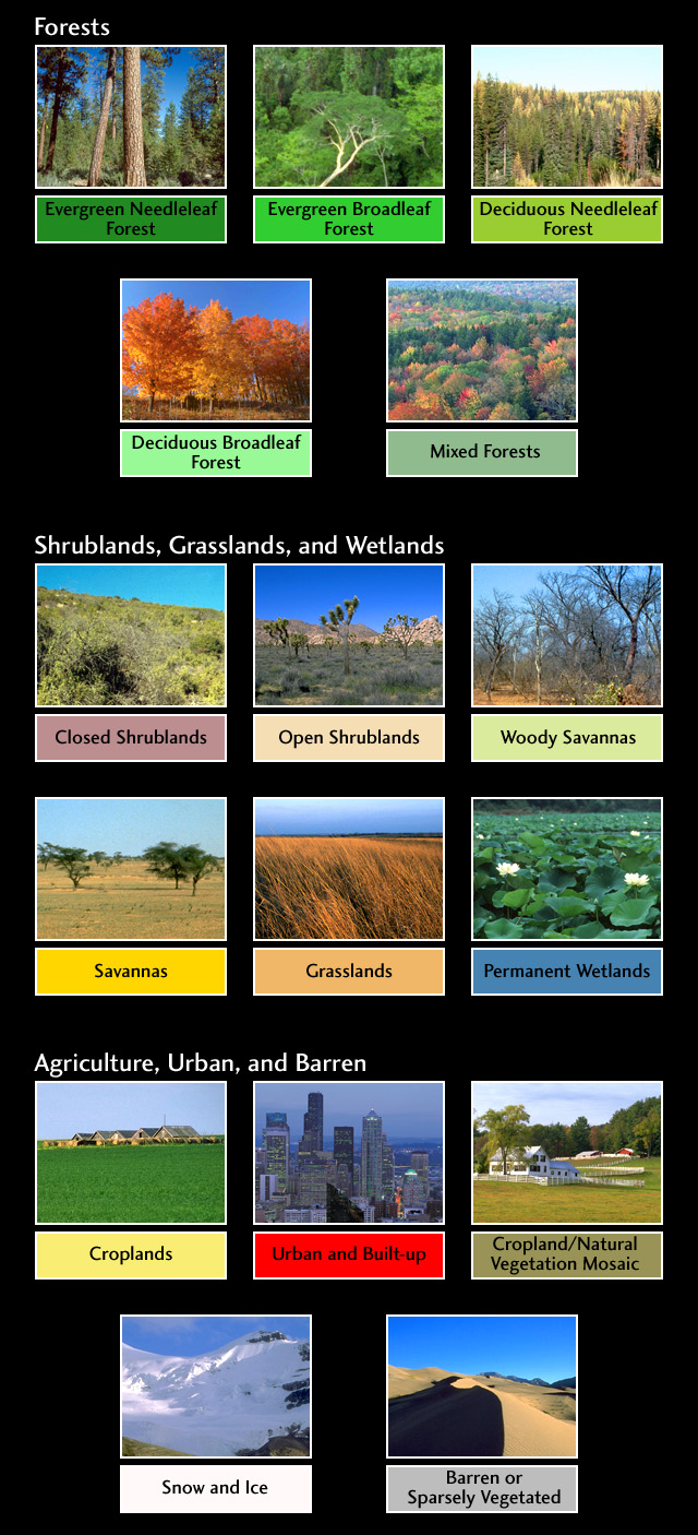
The codes of the classification are described here. In summary, the sea is labeled with 0, forests with 1 to 5, shrublands, grasslands and wetlands with 6 to 11, agriculture and urban lands with 12 to 14, and snow and barren with 15 and 16. This four groups (sea is replaced NA) will be the levels of the factor. (I am not sure if these sets of different land covers is sensible: comments from experts are welcome!)
EDIT: Following a question from a user of rasterVis I include some lines of code to display this qualitative variable in the map.
EDIT2: raster and rasterVis are able to work with categorical data using ratify.
|
1
2
3
4
5
6
7
8
9
10
11
12
13
|
landClass[landClass %in% c(0, 254)] <- NAlandClass <- cut(landClass, c(0, 5, 11, 14, 16))## Add a Raster Atribute Table and define the raster as categorical datalandClass <- ratify(landClass)## Configure the RAT: first create a RAT data.frame using the## levels method; second, set the values for each class (to be## used by levelplot); third, assign this RAT to the raster## using again levelsrat <- levels(landClass)[[1]]rat$classes <- c('Forest', 'Land', 'Urban', 'Snow')levels(landClass) <- ratlevelplot(landClass, col.regions=terrain_hcl(4)) |

This histogram shows the distribution of the population density in each land class.
|
1
2
3
4
|
s <- stack(pop, landClass)layerNames(s) <- c('pop', 'landClass')histogram(~log10(pop)|landClass, data=s, scales=list(relation='free')) |
 Everything is ready for the map. I will create a list of
 trellis objects with four elements (one for each level of the factor). Each of these objects is the representation of the population density in a particular land class. I use the same scale for all of them to allow for comparisons (the at argument of levelplot receives the correspondent at values from the global map)
|
1
2
3
4
5
6
7
8
9
10
11
|
at <- pTotal$legend$bottom$args$key$atpList <- lapply(1:nClasses, function(i){ landSub <- landClass landSub[!(landClass==i)] <- NA popSub <- mask(pop, landSub) step <- 360/nClasses pal <- rev(sequential_hcl(16, h = (30 + step*(i-1))%%360)) pClass <- levelplot(popSub, zscaleLog=10, at=at, col.regions=pal, margin=FALSE)}) |
And that’s all. The rest of the code is exactly the same as in the previous post. If you execute it you will get this image (click on it for higher resolution).

In my previous posts (1 and 2) I wrote about maps with complex legends but without any kind of interactivity. In this post I show how to produce an SVGfile with interactive functionalities with the gridSVG package.
As an example, I use a dataset about population from the Spanish Instituto Nacional de Estadística. This organism publishes information using the PC_Axisformat which can be imported into R with the pxR package. This dataset is available at the INE webpage or directly here.
Let’s start loading packages.
|
1
2
3
4
5
6
7
8
|
library(gridSVG)library(pxR)library(sp)library(lattice)library(latticeExtra)library(maptools)library(classInt)library(colorspace) |
Then I read the px file and make some changes to get the datWide data.frame(which is available here if you are not interested in the PC-Axis details).
|
1
2
3
4
5
6
7
8
9
|
datPX <- read.px('pcaxis-676270323.px', encoding='latin1')datWide <- as.data.frame(datPX, direction = 'wide', use.codes=FALSE)provID <- strsplit(as.character(datWide$provincias), ' ')provID <- as.data.frame(do.call(rbind, provID))names(provID) <- c('code', 'prov')datWide <- cbind(datWide, provID) |
Now it’s time to read a suitable shapefile (read the first post of this series for information about it).
|
1
2
3
4
|
mapSHP <- readShapePoly(fn = 'mapas_completo_municipal/spain_provinces_ind_2')Encoding(levels(mapSHP$NOMBRE99)) <- "latin1"## The encoding must be UTF8 to be correctly displayed in the SVG filelevels(mapSHP$NOMBRE99) <- enc2utf8(levels(mapSHP$NOMBRE99)) |
Both the shapefile and the data.frame have to be combined using the matches between the PROV variable of the shapefile and code from the data.frame. The numeric values of the row names (mapaIDs) will be useful in the last step.
|
1
2
3
4
5
|
idx <- match(mapSHP$PROV, datWide$code)Total <- datWide[idx, "Total"]mapSHP@data <- cbind(mapSHP@data, Total)mapaDat <- as.data.frame(mapSHP)mapaIDs <- as.numeric(rownames(mapaDat)) |
A final step is needed before calling spplot. I will use the functions of gridSVGto include information in the SVG file according to the characteristics of each polygon. Since gridSVG works after the plot has been created, I need a key to identify each polygon and match it with the correspondent element of the original dataset. Unfortunately, the panel.polygonsplot (which is the function used by spplot when drawing polygons) does not assign a name to each polygon. Let’s create a new function (panel.polygonNames) adding a small change in panel.polygonsplot (you should read the full code ofpanel.polygonsplot to understand what is happening here).
|
1
2
3
4
5
6
7
8
|
panel.str <- deparse(panel.polygonsplot, width=500)panel.str <- sub("grid.polygon\\((.*)\\)", "grid.polygon(\\1, name=paste('ID', slot(pls\\[\\[i\\]\\], 'ID'\\), sep=':'))", panel.str)panel.polygonNames <- eval(parse(text=panel.str), envir=environment(panel.polygonsplot)) |
EDITED: Thanks to Andre’s comment (see below), I have found thatpanel.polygonsplot has been changed to add hole-handling. This hack will only work if this new behaviour is disabled with set_Polypath(FALSE) before the next code chunk.
Now everything is ready for drawing. I use the jenks style of theclassIntervals function from the classInt package to set the breaks of the color key.
|
1
2
3
4
5
6
7
|
n=7int <- classIntervals(Total, n, style='jenks')pal <- brewer.pal(n, 'Blues')p <- spplot(mapSHP["Total"], panel=panel.polygonNames, col.regions=pal, at=signif(int$brks, digits=2))p |
EDITED: You can recover the default hole-handling setting withset_Polypath(TRUE) after the p object has been printed.
Once the plot has been created (do not close the graphic window!) thegrid.garnish attaches SVG attributes (in this example onmouseover andonmouseout) to each polygon, which is identified with its name thanks to thepanel.polygonNames function.
These attributes are related to javascript functions (showTooltip andhideTooltip) included in this javascript file (this file is only a minor modification of the original file available at the webpage of the creator of gridand gridSVG). The grid.script function attaches the javascript file to the groband gridToSVG produces the SVG file with a simple HTML page. EDITED: The javascript file (tooltip.js) must be saved in the same folder as the SVG and HTML files.
|
1
2
3
4
5
6
7
8
9
10
11
12
13
14
15
16
17
18
19
20
21
22
23
24
25
|
## grobs in the graphical outputgrobs <- grid.ls()## only interested in those with "ID:" in the namenms <- grobs$name[grobs$type == "grobListing"]idxNames <- grep('ID:', nms)IDs <- nms[idxNames]for (id in unique(IDs)){ ## extract information from the data ## according to the ID value i <- strsplit(id, 'ID:') i <- sapply(i, function(x)as.numeric(x[2])) dat <- mapaDat[which(mapaIDs==i),] ## Information to be attached to each polygon info <- paste(dat$NOMBRE99, dat$Total, sep=':') g <- grid.get(id) ## attach SVG attributes grid.garnish(id, onmouseover=paste("showTooltip(evt, '", info, "')"), onmouseout="hideTooltip()")}grid.script(filename="tooltip.js")gridToSVG('map_with_annotations.svg') |
(Click on the image to show the SVG graphic. Move the mouse over it to display the information)
