Today, we celebrate the would-be 85th birthday of Martin Luther King, Jr., a man remembered for pioneering the civil rights movement through his courage, moral leadership, and oratory prowess. This post focuses on his most famous speech, I Have a Dream [YouTube | text] given on the steps of the Lincoln Memorial to over 250,000 supporters of the March on Washington. While many have analyzed the cultural impact of the speech, few have approached it from a natural language processing perspective. I use R’s text analysis packages and other tools to reveal some of the trends in sentiment, flow (syllables, words, and sentences), and ultimately popularity (Google search volume) manifested in the rhetorical masterpiece.
Bag-of-words

# Load raw data, stored at textuploader.com
speech.raw <- paste(scan(url("http://textuploader.com/1k0g/raw"),
what="character"), collapse=" ")
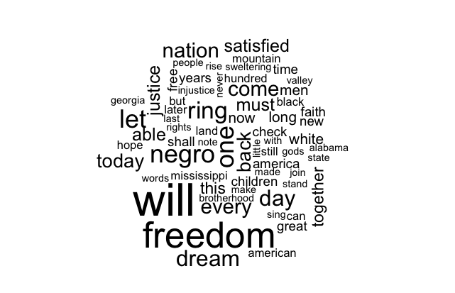
library(wordcloud)
wordcloud(speech.raw) # Also takes other arguments like color
Calculating textual metrics
library(qdap)
library(data.table)

# Split into sentences
# qdap's sentSplit is modeled after dialogue data, so person field is needed
speech.df <- data.table(speech=speech.raw, person="MLK")
sentences <- data.table(sentSplit(speech.df, "speech"))
# Add a sentence counter and remove unnecessary variables
sentences[, sentence.num := seq(nrow(sentences))]
sentences[, person := NULL]
sentences[, tot := NULL]
setcolorder(sentences, c("sentence.num", "speech"))

# Syllables per sentence
sentences[, syllables := syllable.sum(speech)]
# Add cumulative syllable count and percent complete as proxy for progression
sentences[, syllables.cumsum := cumsum(syllables)]
sentences[, pct.complete := syllables.cumsum / sum(sentences$syllables)]
sentences[, pct.complete.100 := pct.complete * 100]
pol.df <- polarity(sentences$speech)$all
sentences[, words := pol.df$wc]
sentences[, pol := pol.df$polarity]
with(sentences, plot(pct.complete, pol))

library(ggplot2)
library(scales)

my.theme <-
  theme(plot.background = element_blank(), # Remove background
        panel.grid.major = element_blank(), # Remove gridlines
        panel.grid.minor = element_blank(), # Remove more gridlines
        panel.border = element_blank(), # Remove border
        panel.background = element_blank(), # Remove more background
        axis.ticks = element_blank(), # Remove axis ticks
        axis.text=element_text(size=14), # Enlarge axis text font
        axis.title=element_text(size=16), # Enlarge axis title font
        plot.title=element_text(size=24, hjust=0)) # Enlarge, left-align title

CustomScatterPlot <- function(gg)
  return(gg + geom_point(color="grey60") + # Lighten dots
           stat_smooth(color="royalblue", fill="lightgray", size=1.4) +
           xlab("Percent complete (by syllable count)") +
           scale_x_continuous(labels = percent) + my.theme)

CustomScatterPlot(ggplot(sentences, aes(pct.complete, pol)) +
                    ylab("Sentiment (sentence-level polarity)") +
                    ggtitle("Sentiment of I Have a Dream speech"))

Readability tests are typically based on syllables, words, and sentences in order to approximate the grade level required to comprehend a text. qdap offers several of the most popular formulas, of which I chose the Automated Readability Index.
sentences[, readability := automated_readability_index(speech, sentence.num)
          $Automated_Readability_Index]
CustomScatterPlot(ggplot(sentences, aes(pct.complete, readability)) +
                    ylab("Automated Readability Index") +
                    ggtitle("Readability of I Have a Dream speech"))

Scraping Google search hits
GoogleHits <- function(query){
  require(XML)
  require(RCurl)

  url <- paste0("https://www.google.com/search?q=", gsub(" ", "+", query))

  CAINFO = paste0(system.file(package="RCurl"), "/CurlSSL/ca-bundle.crt")
  script <- getURL(url, followlocation=T, cainfo=CAINFO)
  doc <- htmlParse(script)
  res <- xpathSApply(doc, '//*/div[@id="resultStats"]', xmlValue)
  return(as.numeric(gsub("[^0-9]", "", res)))
}
sentences[, google.hits := GoogleHits(paste0("[", gsub("[,;!.]", "", speech),
                                             "] mlk"))]
ggplot(sentences, aes(pct.complete, google.hits / 1e6)) +
  geom_line(color="grey40") + # Lighten dots
  xlab("Percent complete (by syllable count)") +
  scale_x_continuous(labels = percent) + my.theme +
  ylim(0, max(sentences$google.hits) / 1e6) +
  ylab("Sentence memorability (millions of Google hits)") +
  ggtitle("Memorability of I Have a Dream speech")

head(sentences[order(-google.hits)]$speech, 7)
[1] "free at last!"
[2] "I have a dream today."
[3] "I have a dream today."
[4] "This is our hope."
[5] "And if America is to be a great nation this must become true."
[6] "I say to you today, my friends, so even though we face the difficulties of today and tomorrow, I still have a dream."
[7] "We cannot turn back."
Plotting Google hits on a log scale reduces skew and allows us to work on a ratio scale.
sentences[, log.google.hits := log(google.hits)]

CustomScatterPlot(ggplot(sentences, aes(pct.complete, log.google.hits)) +
                    ylab("Memorability (log of sentence's Google hits)") +
                    ggtitle("Memorability of I Have a Dream speech"))

What makes a passage memorable? A linear regression approach
library(MASS) # For stepAIC
google.lm <- stepAIC(lm(log(google.hits) ~ poly(readability, 3) + pol +
                          pct.complete.100, data=sentences))
summary(google.lm)
Call:
lm(formula = log(google.hits) ~ poly(readability, 3) + pct.complete.100,
    data = sentences)

Residuals:
    Min      1Q  Median      3Q     Max
-4.2805 -1.1324 -0.3129  1.1361  6.6748

Coefficients:
                        Estimate Std. Error t value Pr(>|t|)
(Intercept)            11.444037   0.405247  28.240  < 2e-16 ***
poly(readability, 3)1 -12.670641   1.729159  -7.328 1.75e-10 ***
poly(readability, 3)2   8.187941   1.834658   4.463 2.65e-05 ***
poly(readability, 3)3  -5.681114   1.730662  -3.283  0.00153 **
pct.complete.100        0.013366   0.006848   1.952  0.05449 .
---
Signif. codes:  0 ‘***’ 0.001 ‘**’ 0.01 ‘*’ 0.05 ‘.’ 0.1 ‘ ’ 1

Residual standard error: 1.729 on 79 degrees of freedom
Multiple R-squared:  0.5564, Adjusted R-squared:  0.534
F-statistic: 24.78 on 4 and 79 DF,  p-value: 2.605e-13
exp(google.lm$coefficients["pct.complete.100"])
pct.complete.100
        1.013456
This result can be interpreted as the following: a 1% increase in the location of a sentence in the speech was associated with a 1.3% increase in search hits.
Interpreting the effect of readability is not as straightforward, since I included polynomials. Rather than compute an average effect, I graphed predicted Google hits for values of readability’s observed range, holding pct.complete.100 at its mean.
new.data <- data.frame(readability=seq(min(sentences$readability),
                                       max(sentences$readability), by=0.1),
                       pct.complete.100=mean(sentences$pct.complete.100))

new.data$pred.hits <- predict(google.lm, newdata=new.data)

ggplot(new.data, aes(readability, pred.hits)) +
  geom_line(color="royalblue", size=1.4) +
  xlab("Automated Readability Index") +
  ylab("Predicted memorability (log Google hits)") +
  ggtitle("Predicted memorability ~ readability") +
  my.theme

This cubic relationship indicates that predicted memorability falls considerably until about grade level 10, at which point it levels off (very few passages have readability exceeding 25).
Conclusion
- The speech starts and (especially) ends on a positive note, with a positive middle section filled with two troughs to vary the tone.
- While readability/complexity varies considerably within each small section, the overall level is fairly consistent throughout the speech.
- Readability and placement were the strongest drivers of memorability (as quantified by Google hits): sentences below grade level 10 were more memorable, as were those occurring later in the speech.
To a degree, these were intuitive findings–the ebb and flow of intensity and sentiment is a powerful rhetorical device. While we may never be able to fully deconstruct the meaning of this speech, techniques explored here can provide brief insight into the genius of MLK and the power of his message.
Acknowledgments
- Special thanks to Ben Ogorek for guidance on some of the statistics here, and for a thorough review.
- Special thanks to Mindy Greenberg for reviewing and always pushing my boundaries of conciseness and clarity.
- Thanks to Josh Kraut for offering a ggplot2 lesson at work, inspiring me to use it here.